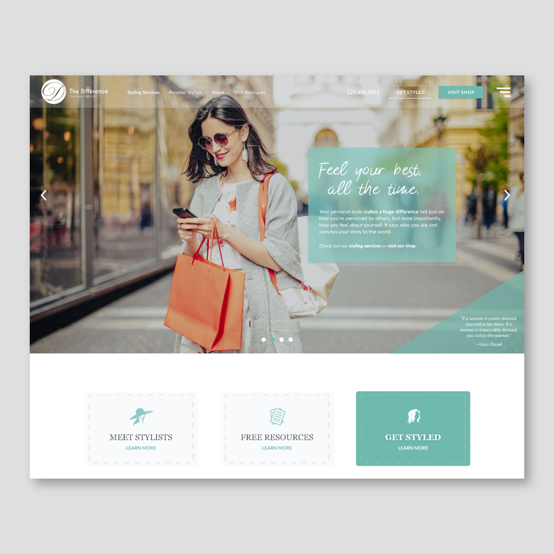
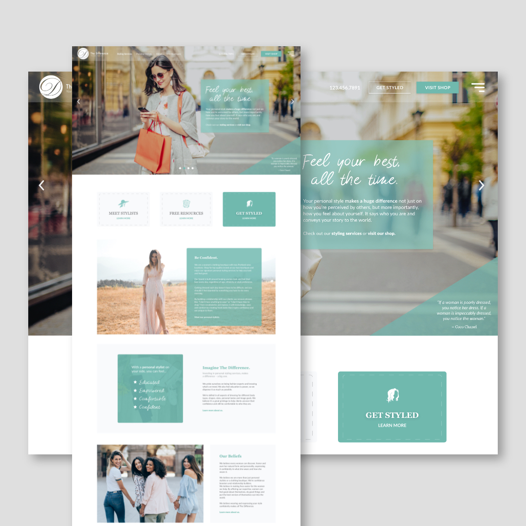
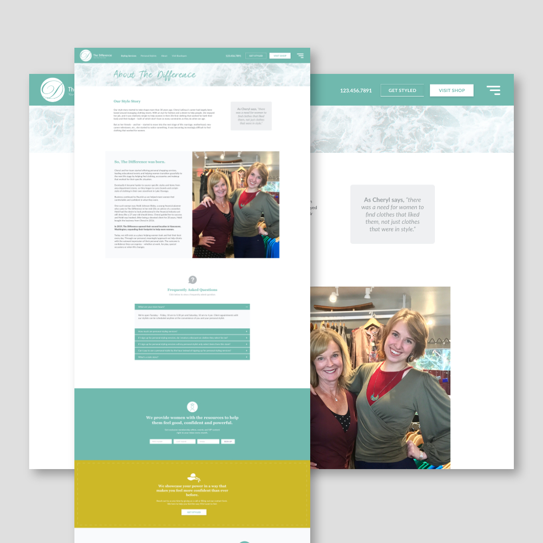
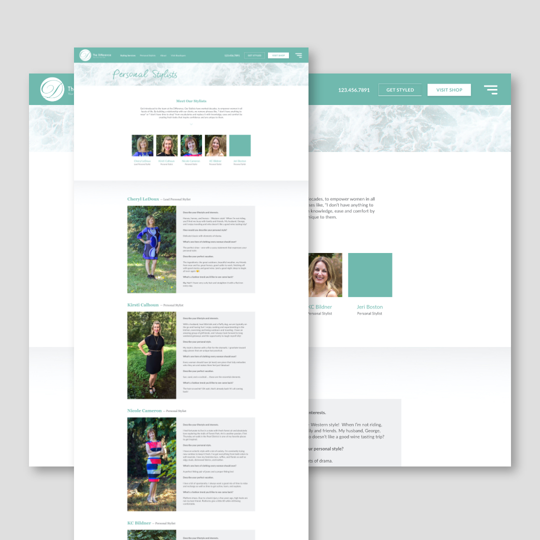
High-Fashion Alternate Design for The Difference
I don’t normally included alternate designs, but I really liked how this one came out. I steered away from pastel colors and focused more on their core brand color, teal with a little gray and white mixed in to balance things out. I then used the photography to bring more color and style to each page.
Let’s chat about your project.
Free estimates, fixed prices and a clear scope of work. Your brand, our vision and your users. Let’s get to work and create a presentation audiences will love.
