Something I’ve really enjoyed about the Marvel Cinematic Universe is the aesthetic. There’s a cohesive style across the marketing materials, films, shows and other merchandise. This is no easy feat and at the core, it means there’s a plan and a brand message the organization has agreed to and continue to work against while they close out their incredible saga with the Infinity War films.
So, let’s take a look at some art totally jacked from screenshots of shows and films (please don’t sue me).
Skip to Section:
Iron Man 1
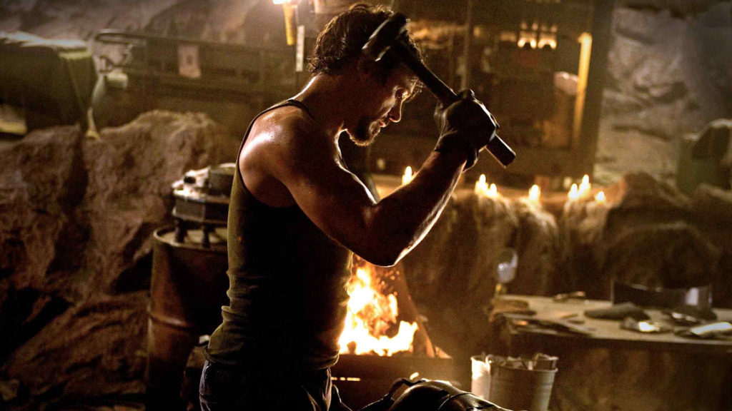
The first in the Marvel Universe (aside from the Incredible Hulk … ) was set largely in caverns, cannons, dirt and sand. Even through the films progression and return to modern civilization you can’t help but feel that “coarseness” throughout the film.
There are some unique undertones here as visuals are often paired with the feeling a Director is trying to bring to both a film and character. This film kickstarted a crazy journey for Marvel.
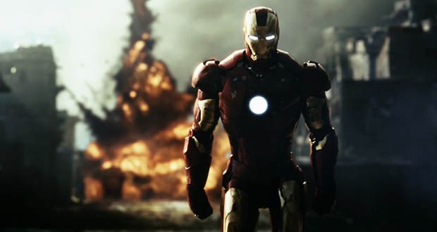
At times, it gets dark but it rarely strays from the dirt and sand vibe mentioned above. Jeff Bridges is part of that aesthetic too. By nature, he provides a level of the “Wild West” which works great against Downey’s more progressive portrayal of Tony Stark.
Iron Man 2
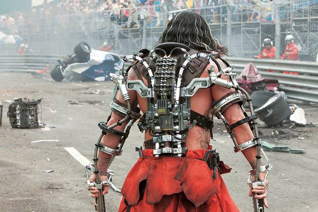
Stylistically, the dirt and sand is gone and we’re back to mainstream atmospheres and antics. The film struggled to maintain lasting appeal, it still made oodles of money, but the audience wanted more.
Why’d this happen? My thought is that Marvel wanted to bring too many new worlds and characters together at the same time. Cheadle came in as War Machine, we had Iron Man, Whip Lash and other prominent Marvel characters chewing up screen time.
The film, was much shinier this time around with a layer of polish and an attention to detail that made for a really incredible scene with Whiplash vs a Formula car.
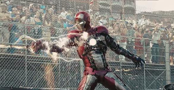
The ensuing battle was fun, but cut a little too short. Here, I think they missed an opportunity to make this one of the best scenes Marvel has ever produced.
Iron Man 3
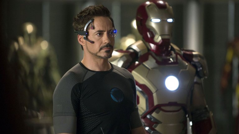
The tone of Iron Man 3 shifted sharply, and for the better, I think. It went back to it’s roots and what made Iron Man 1 so successful. Translation, it got darker. Both visually and thematically it was a much darker film with some over the top antics, sure, but it wasn’t a happy-go-lucky Stark.
Downey spread his wings and brought the character back to reality. The film focused on obsessions and redemption. Full of blues, dark tones and rust. This was Marvels return to setting a character in moral and physical peril.
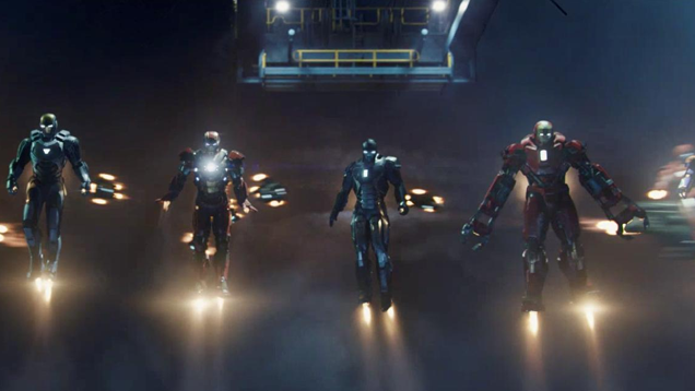
In the end, we encounter an embattled Stark who had his heart ripped out. He proceeds to kick some serious ass with is onslaught of robots hat seemingly come out of know where. By the time the movie closes, we’re treated to a silly, but neat, fireworks show as Tony sets all his bots to self-destruct.
…cause, who cares about all those millions of dollars in parts and materials 🙂
Captain America: The First Avenger
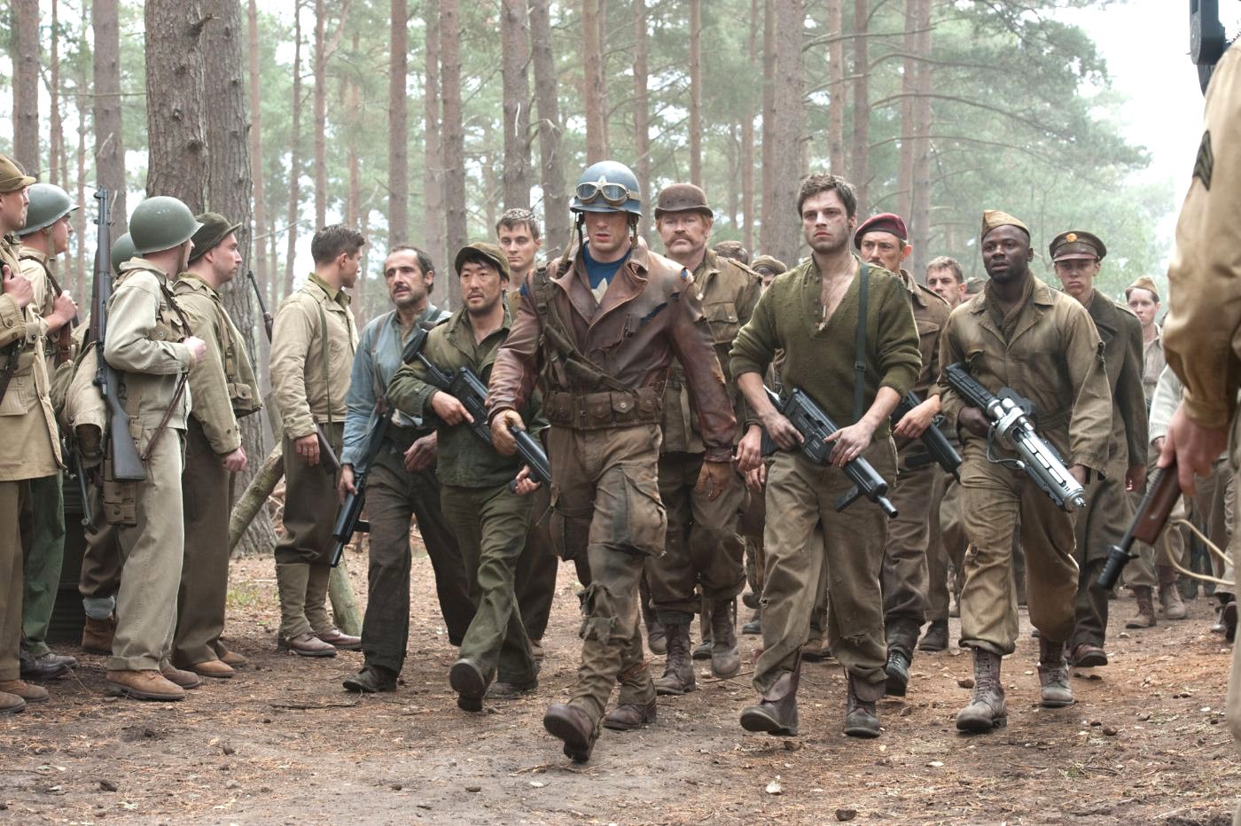
One of the best in the MCU, Cap set the stage for a lot of other movies and started to unite the universes through various plot lines. Espionage and war carried the theme of the film and in typical fashion.
Generally dark, lower contrast and a little desaturated. The color corrections gave the film enough flavor and style without having to go full Saving Private Ryan (great movie).
The truth is, Marvels heads likely wanted a “war-torn” vibe without scaring the children too much. After all, these are movies about comic book characters!
Still, they pulled it off with a film that appeals to a wide audience.
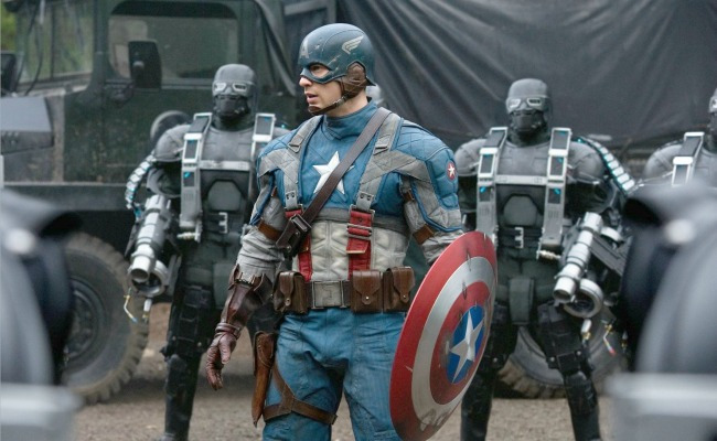
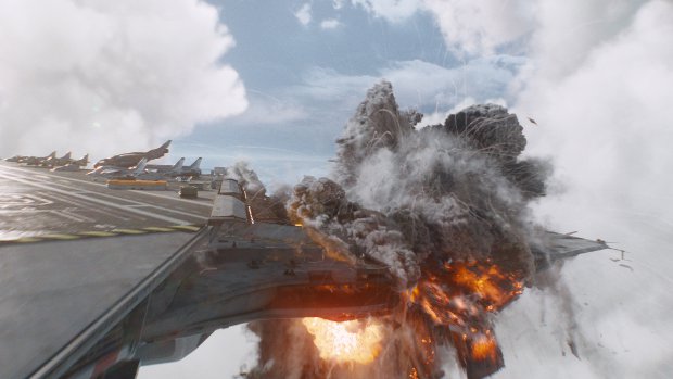
Captain America: The Winter Soldier
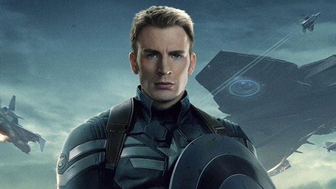
Damn, this movie is good. Seriously, I love spectacle and Cap 2 was dramatically different from his first outing. At its heart, it’s still a war time film, but now we introduce a few new characters and build off others.
Caps fighting style changed too resulting in a high-energy and fast-paced action flick that gets you pumped to go sprinting down the middle of a tunnel during rush hour 🙂
Seriously though, the tone was lifted. The film is visually brighter and loaded with VFX and large sets. Like the entire closing scene, we’ve got hellacarriers bursting, incredible particle effects and panoramics.
The films tone stays consistent throughout and rarely deviates to that “here’s the bad guy in a dark room” setting. There’s a ton of heart here too. Where the story arc revolves around lost friendship.
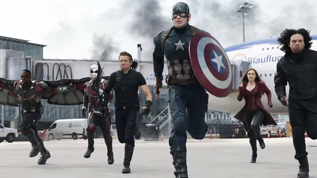
Captain America: Civil War
If you haven’t seen this movie, get out 🙂
Cap 3, Civil War was freaking cool. It rarely made sense, but that didn’t matter because we all knew an epic ass whooping was coming on screen at a level we had never seen before…and that’s what we got.
It kinda felt like two movies in one. You had an arc around super heroes not getting along and a completely different arc that focused on the relationships between Bucky, Cap and Iron Man.
Even so, it was something to behold!!!! Cap 3 followed the same style as Cap 2 which makes sense give the same directorial team stayed on to produce this film. It was pretty incredible. They packed so many characters in a small space. You’d think it wasn’t possible.
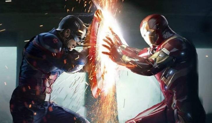
What I’ll point out here, is the difference in tone towards the end of the film which went FULL aggro-emo. Not in a bad way, but the film got dark immediately and then we witnessed a brutal fight between friends with cool backdrops, sparkly violence and high contrast.
This is definitely one of my favorite Marvel films.
Thor
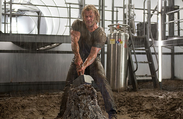
One of Marvel’s biggest challenges was to bring a hammer wielding God to the screen without it being a cornier-than-Kansas adaption.
I mean, anyone who knows comics, knows that Thor wasn’t exactly the most aesthetically pleasing character in the universe. This creative challenge resulted in the story of Thor, not being Thor anymore. Which was a great way to jump into a world without confusing the shit out of the audience.
I’d say this film felt a lot like Iron Man 2, a lot was moving at one time though the character development was much stronger here as Loki and others stole the show.
The film didn’t bend in any one clear direction in terms of style. There was more focus on telling a story than anything else, but how about that rainbow bridge on Asgard?
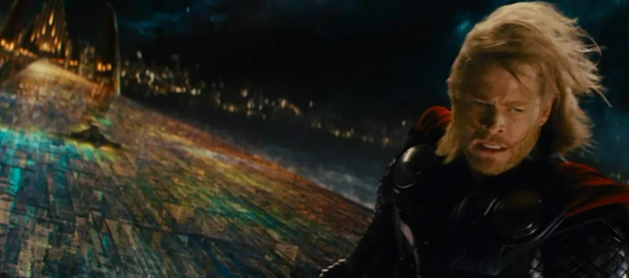
Damn. I’d watch a movie about that alone because the visuals in that last scene are incredible. We start with a shiny world, end out on Earth and then back to Thor’s home for an ass kicking. And, it was glorious.
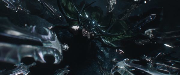
Thor: The Dark World
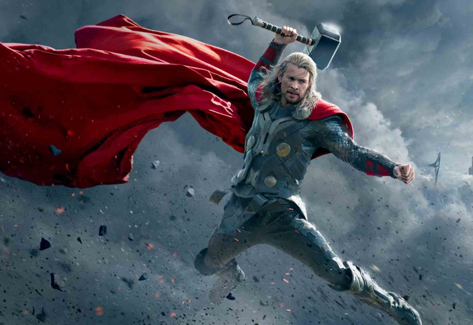
Whelp.
It wasn’t the best film in the MCU, but I still don’t think it was the worst. One of the challenges here, is that Thor had to go, erm dark. As far as tone goes. The theme of the movie is MASS DESTRUCTION, shocker I know.
In order to progress the core arc of the MCU, they had to bring in new characters and worlds. They had to expand on the actual lore instead of making a movie about kicking ass, losing your way, etc. With that, they had to bring in other races and gods.
The film is full of grit and color like the shot above. It’s noticeably darker, rusted and shiny when they arrive at Asgard.
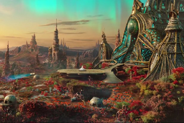
Thor: Ragnarok
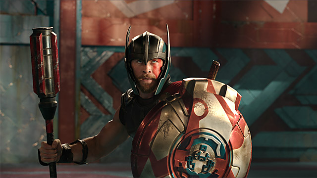
By far, one of Marvels best trailers ever. Thor 3 looks more like a moving fresco than anything else. We’ve got our favorites back together on screen (Thor/Loki) and we have some pretty epic throw-downs.
That said, there’s an orange/gold vibe about the film which makes sense since we’re returning to Thor’s home. While that’s true, he faces exile and Marvel brought the flavor of each location to the actual color correction, sets and visuals.
The planet Thor finds himself on is absolutely stunning. It’s like looking at a beautiful set of brand new crayons with a super sharp level of detail around objects. It’s flashy and gorgeous form start-to-finish.
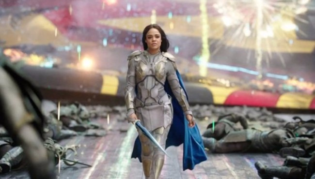
The two images above represent this very well. You have a glowing, bright, vibrant and poppy environment mixed with scenes full of down right darkness, violence and malice.
This contrast between visuals along with the Thor’s new look, the story and the actors behind the characters set the stage for a huge hit. It’s gonna be the film that reasserts Thor’s place in the MCU (and his companions).
Guardians of the Galaxy
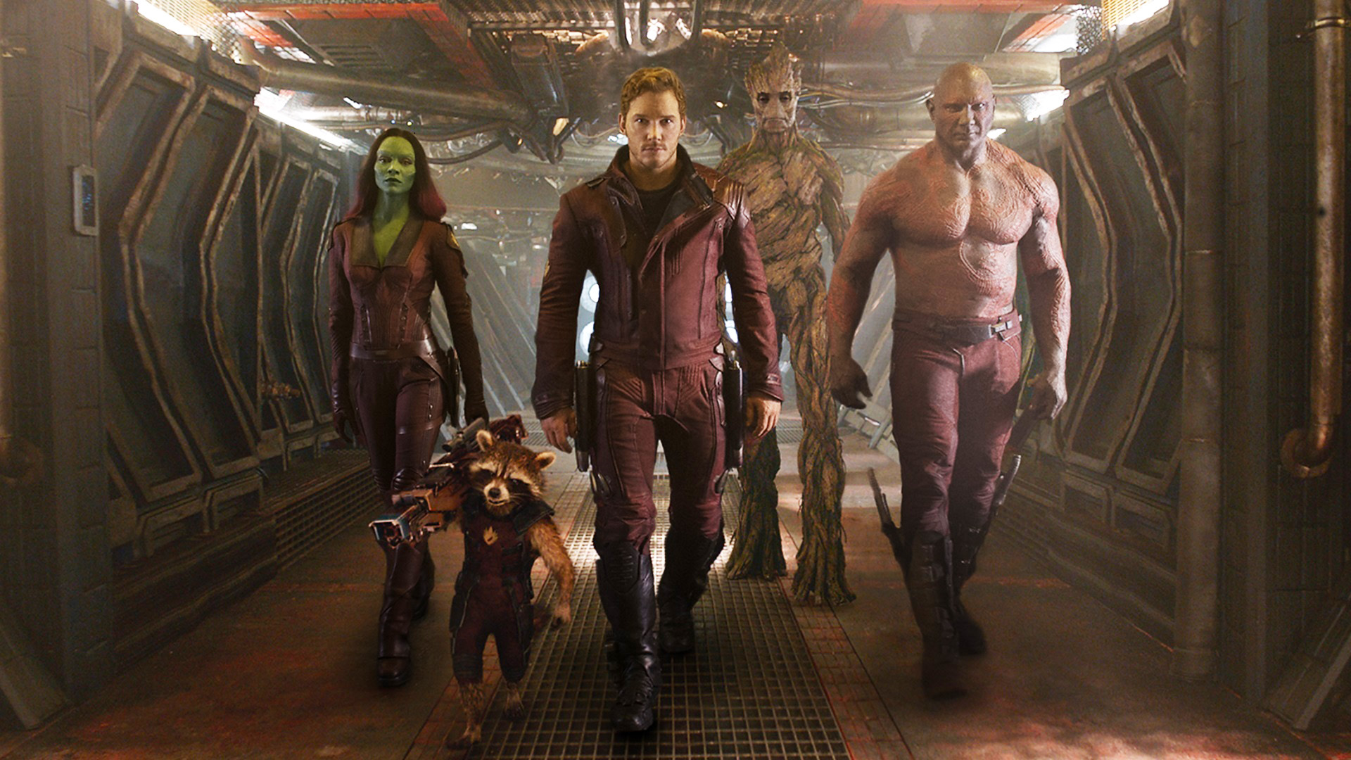
One of Marvels breakout hits, the Guardians of the Galaxy proved that if done right, a talking raccoon and grumbling tree can capture hearts in unprecedented ways.
It’s a space epic full of unique landscapes and visual design. The sets are incredibly detailed and unique all the way from the opening sequence to the climatic final battle. We explore different areas in the Guardians universe.
If I had to summarize the style, I’d say “grunge” or “steampunk”. There’s definitely nothing else like it in the MCU. The standout moments for me, lie within the opening sequence and the world Star Lord finds himself on followed by the prison scene and the accompanying escape sequence.
Guardians of the Galaxy Vol. 2
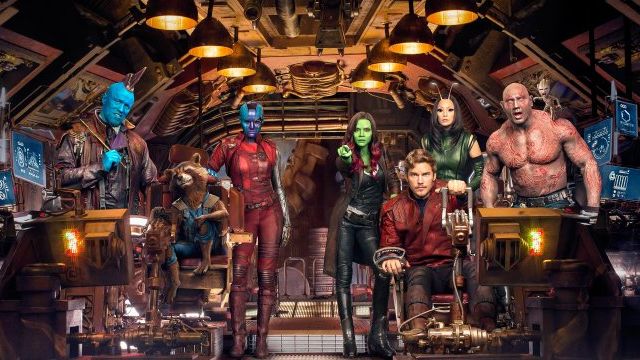
Not as strong as there first outing, but still fun. Vol. 2 is beautifully designed with most deviations in artistic style coming from Ego’s planet and everything inside it. It’s a lush landscape with unique objects and life.
It’s bright too, something I didn’t expect and the prison scene is back, at a different capacity that got a lot more laughs than I thought it would.
The film builds on the last while throwing in a few laughable elements (not in a good way) while wrapping with a gut wrenching end. Vol. 2 definitely looked incredible, but nothing specific that made it really stand out like it’s predecessor.
Ant-Man
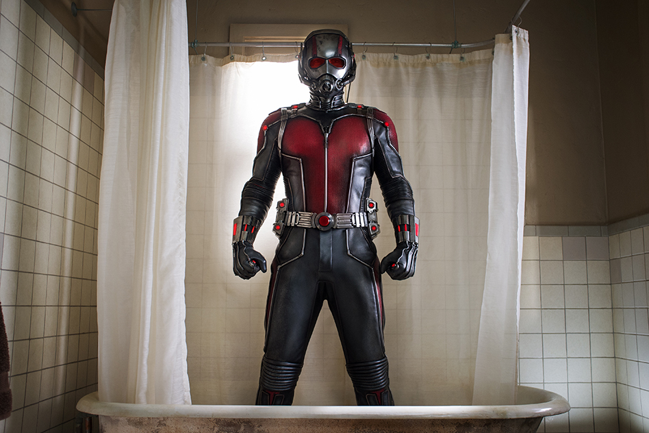
It’s tough that after so many films, to make something your own or something that audiences haven’t seen before. Ultimately Ant-Man is a down-to-earth flick that works as a launching pad for more stories for other characters.
It’s visual design, is in the spirit of Iron Man 2 or Thor 1. You’ve got the rusty flavor throughout the film as seen in the image above. That style is pretty persistent. Even in the films climatic end.
The result, is a movie establishing Ant-Man as a character who comes from a world full of middle class citizens. Basic homes, some dirty stuff, but everyone works hard or wants to 😀
Ant-Man and the Wasp
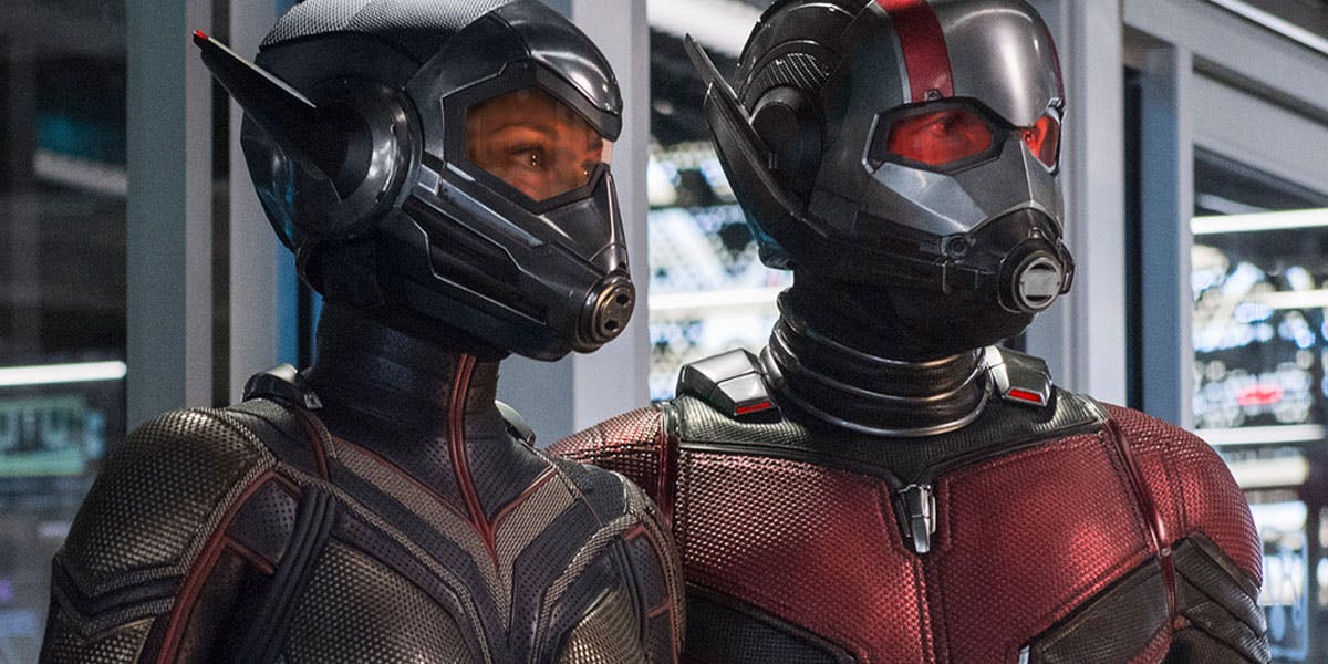 The Ant-Man and the Wasp trailer dropped and it’s pretty epic. It’s about time we get to see Wasp kick some serious bad guy ass. The tone is right in line with the last film and the MCU tie-ins are abundant.
The film, while strong, does little in terms of pushing the boundaries of the series. We know that this particular set of films are filler by injecting key elements of the overarching Phase films into the plot. The action is on point and the style is completely aligned with the first, however, there’s little to no interaction with the creatures that made the first film so fun.
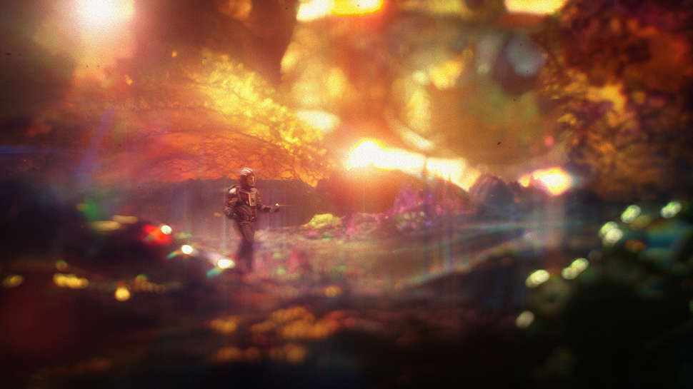
The stand out moments come at the end when the heroes enter the quantum realm. These scenes give us a real sense of an alien world that exists beyond explanation and the use of visual elements and sound make this scene completely engulfing.
Doctor Strange
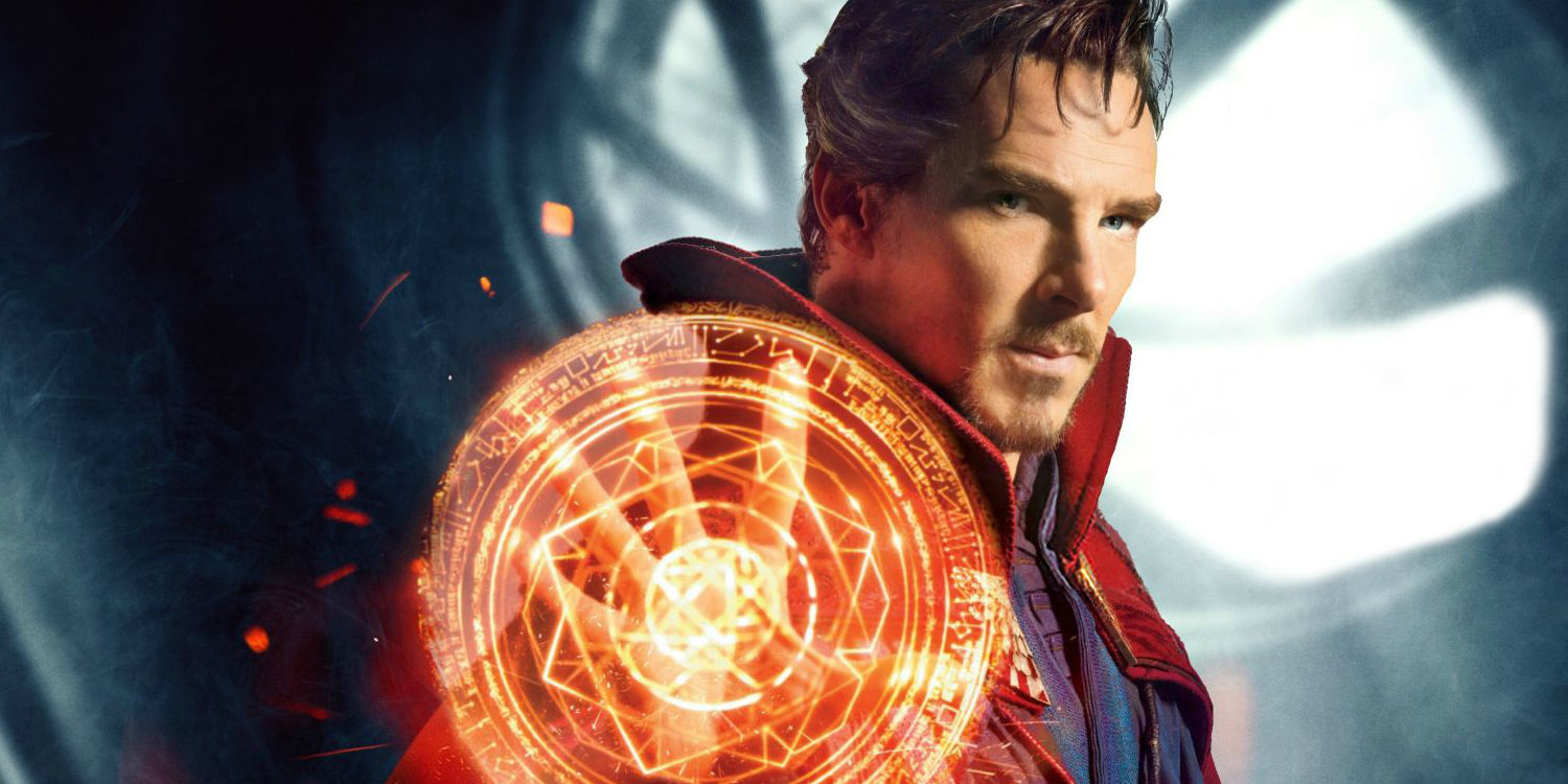
This is one of my favorites, for sure. At this point in the post, you can probably see a pattern between some of these MCU films. If it’s on Earth, they lean towards a rustic feel. Otherwise, we’re in space, on another planet, etc.
In Strange, we have a nice blend of both. The world is our own, but they open our eyes to the magic hidden within it. This is where they excel.
The film jumps between rustic and blue hues often. In most cases, you get that cool vibe from the hospital scenes which are typical for many reasons (not gonna get into that here). When Strange is taken out of his comfort zone, things get rustic and orange.
While that’s true, we get to see and feel other environments especially towards the end when they’re battling in the mirrored realities.
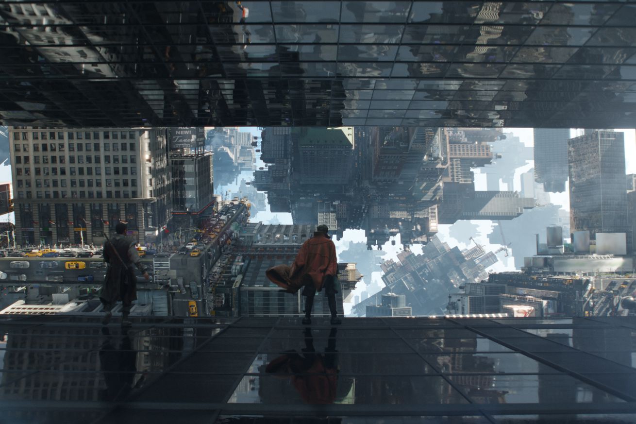
You can see both a blend of high and low contrast in the shot above. In the end, we get a unique flavor based on the set we find our characters in. Ultimately this leads to both a unique experience and entraining film.
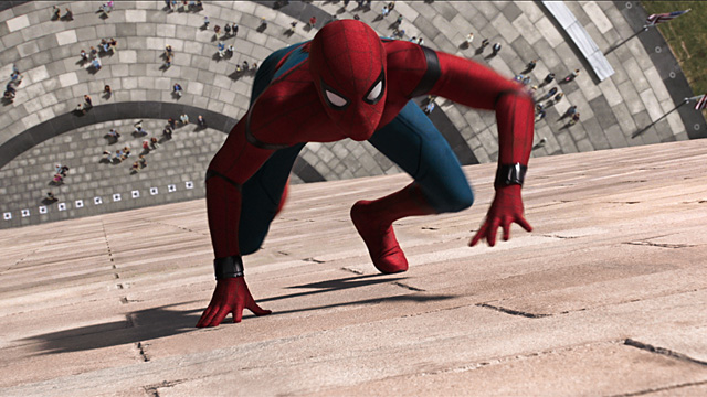
Spider-Man: Homecoming
Before I begin…
I LOVE THIS FUCKING MOVIE (sorry, language).
Really though, this is my favorite film out of the entire MCU. Maybe it’s because I can relate to Peter Parker or maybe it’s because it’s just so damn cool. It’s all of the above really.
Okay so where does this movie fall in terms of style when compared to other Marvel films? Well, in the current MCU I’d compare it to Iron Man 2. In other words, it’s in a grounded environment, so your sets aren’t exactly going to be out of this world. Peter Parker exits in the real world.
That said, damn there’s a lot of polish here and the design of Peter’s suit and accompanying AI is absolutely brilliant. Keaton and his gang are great too. Keaton is a menace and I love every inch of it. The weaponry looks and sounds amazing. There are enough particle effects and flares here for you Abrams fans.
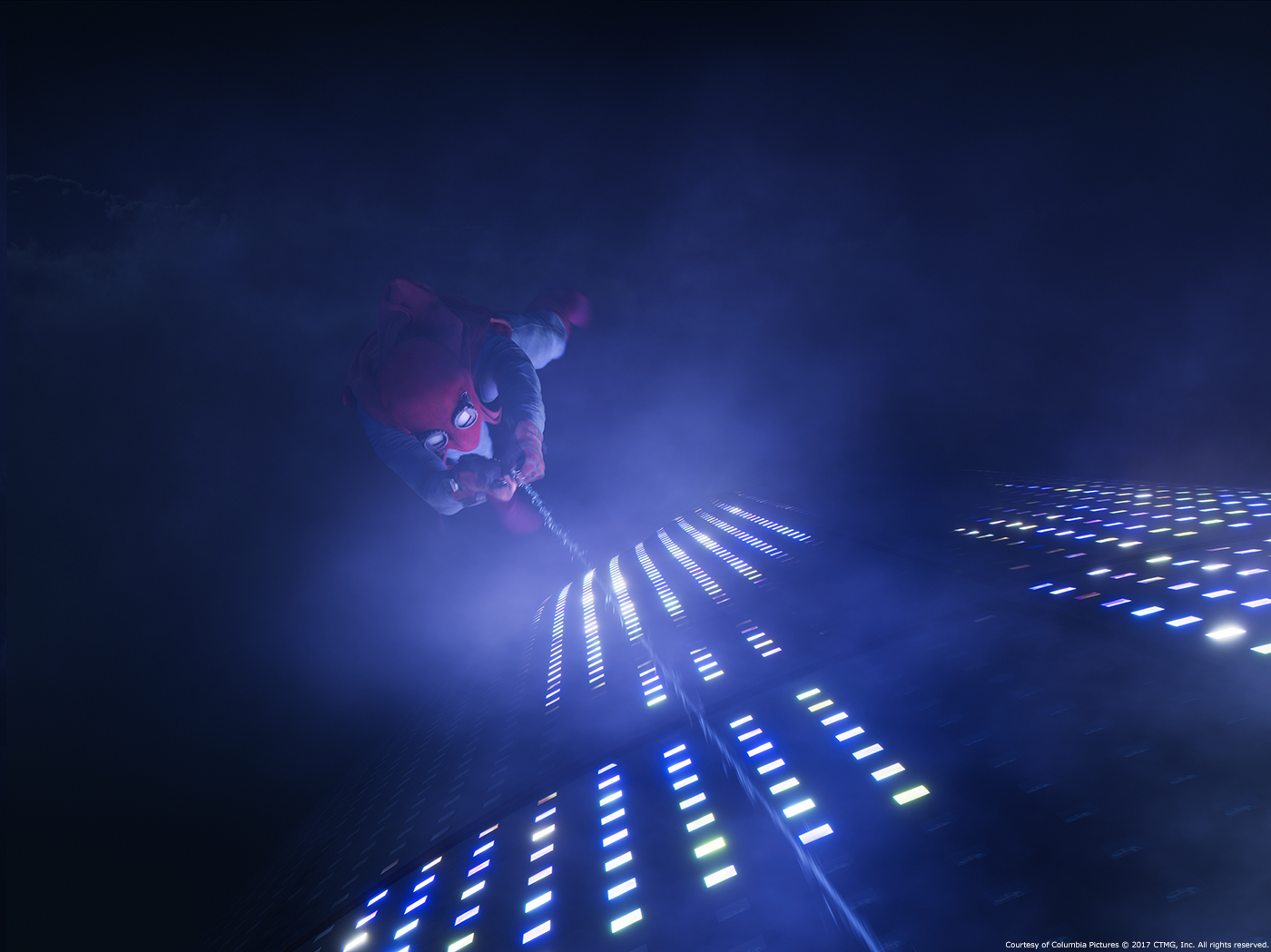
There’s a general “warmth” to the visual feel of the film and it slowly progresses to darker and more desperate tones.
Black Panther
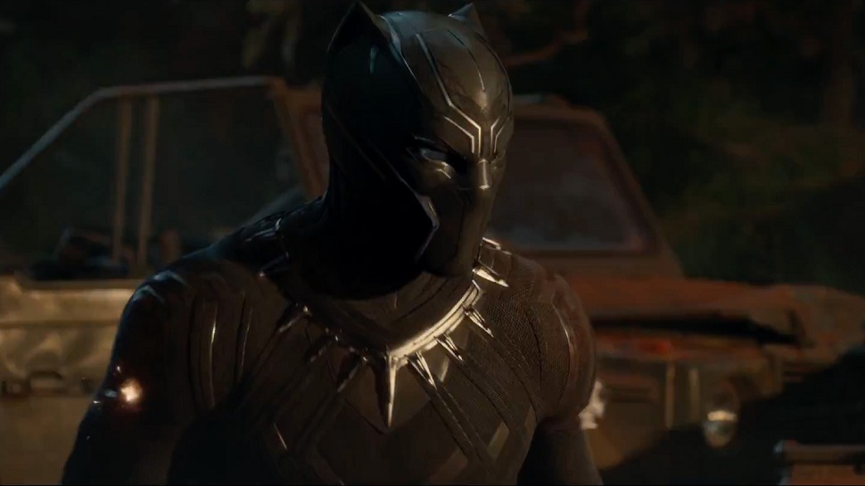
Panther is likely to lean heavily on Wakanda visuals and backdrop because of the nature of the character and it’s origin story, it’s likely to lean “dirtier” and “orange”. The scene above is an example of this as the characters suit is obviously black, however, the shot is color corrected with orange glows.
This often done to increase aesthetic because if you released this same scene without color correction, it wouldn’t feel as exciting. Frankly, you’d be wondering if the filmmakers took any time “polishing” the film. While not super relevant to this post, I will say that the suit is totally on point. It’s incredibly designed, powerful and scary as hell.
Now after seeing the movie, I can assure, it’s a wonderful piece of work. Aside from its typical ups and downs of a comic book film, it falls closely inline with the visual appeal of Thor Ragnarok. That same bright aesthetic is ever present. The film glows with deep blacks, purples and clay tints. It’s lovely and you should check it out just for the costumes, makeup and spectacle of it.
The Avengers
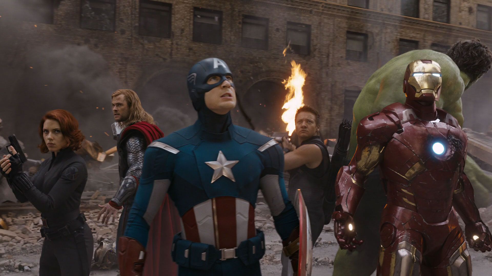
The first of the Avenger films laid the groundwork for a lot of other Marvel movies. They did a great job here and it feels a lot like Spiderman: Homecoming or Iron Man 2. Again, they attempt to ground the film as much as possible.
There’s not a ton here that pushes the visual envelope, but it does fall in line nicely with their strategic Phase 1 set of films. They’ve done what they could to blend the various stories together.
Most agree that they nailed it, still though, it would have been nice to see a little more visual depth.
Avengers: Age of Ultron
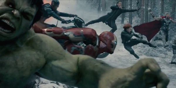
kjasdflkjhaslfkhjaslkfhja;lsjf;alskfjd
That pretty much sums up how I feel about this one. The scene above is overzealous, but the shot, is perfect. It’s blue hue and action make it a lot of fun to watch.
Unfortunately, I thought Ultron’s character was flat and uninteresting. The trailers definitely paved a different path than what Ultron gave us. Which is fine, when the twists are good 🙂 Aside from the opening sequence, the climactic end is where AoU shines the most with the various characters, new and old, gather around for an incredible 360 shot of the team whooping some robot ass.
…I almost forget, the Hulkbuster sequence. Which was definitely another stand out segment.
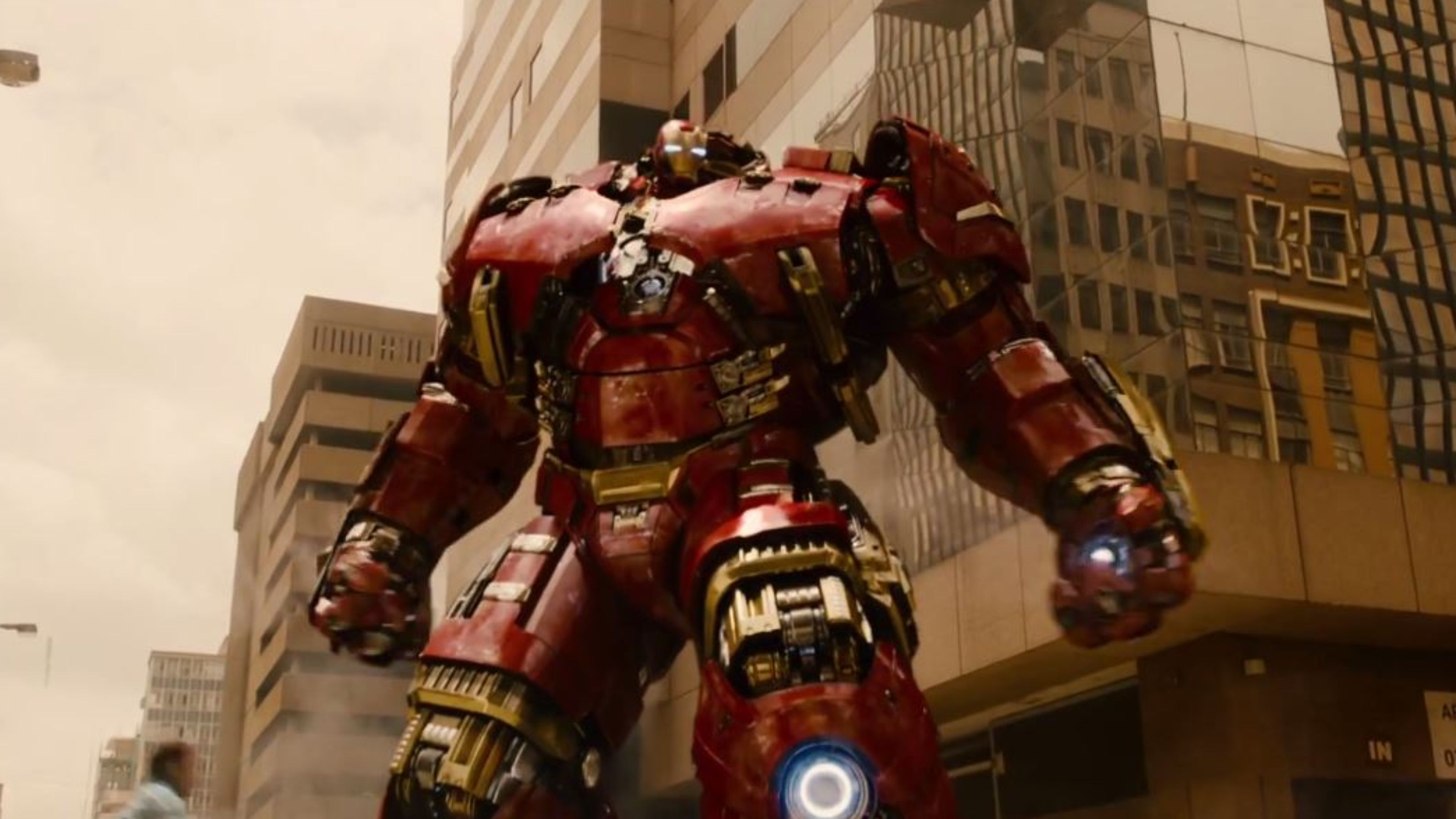
Again, you can see a theme here in the MCU. The shot is slightly washed out. Colors are replaced with an orange hue to give it a more interesting feel.
Even though, you know, this scene is taking place in nothing more than your average city. We know what those look like people! BUT, throw some color correction on there then BAM everything is better! 🙂
All that to say, AoU wasn’t a great movie but it did it’s part to try and connect worlds together in Phase 2.
The Avengers: Infinity War
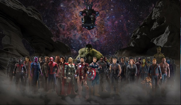
Not a lot is known about Infinity War. I mean, there are storylines out there in the comic book world, but in terms of the liberties, Marvel will take, are largely unknown.
We do know that worlds collide and that we can expect to see every major Marvel character join in on the fight and it’ll likely span both space and Earth. Since the Russo Brothers are wrapping up Phase 3 with this film I’d say you’re in for a Winter-Soldier-meets-Guardians-of-the-Galaxy feel.
We’re gonna get that flavor that made Soldier and Civil War epic and fast-paced while they pull in the unique qualities of the Guardians and Thor worlds.
Updated 8/28/18
Okay, so this movie hit earlier this year and it’s hands down, incredible. The style of this film freshly combines the elements from all other previous entries into a cohesive visual onslaught. There are so many “wow” moments all throughout the film. Everything from the various street encounters, to the closing act and the off-world fights in between.
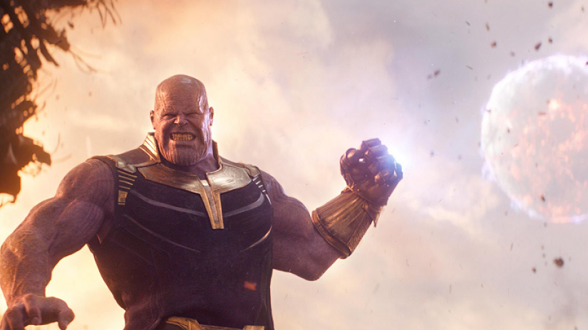
The might of Thanos was shown in exquisite fashion on screen. All the elements are present and the various designs of the stones are put to use. It was incredible to see how effective the VFX team was at bringing whole worlds to life in a way where you could feel the impact of the action throughout. We’re now one film away from closing these 3 phases of the current Marvel universe.
The above was written before I saw the trailer, with the trailer out now, I can say I was dead on. Let’s hope though, that we don’t lose too much to (bad) CG.
Want to watch these movies in the right order, then here it is!
All the Marvel movies in order, including upcoming films. Order will be updated based on stories for future releases.
- Iron Man (2008)
- Iron Man 2 (2010)
- The Incredible Hulk (2008)
- Thor (2011)
- Captain America: The First Avenger (2011)
- Marvel’s The Avengers (2012)
- Iron Man 3 (2013)
- Thor: The Dark World (2013)
- Guardians of the Galaxy (2014)
- Guardians of the Galaxy Vol. 2 (2017)
- Captain America: The Winter Soldier (2014)
- Avengers: Age of Ultron (2014)
- Ant-Man (2015)
- Doctor Strange (2016)
- Captain America: Civil War (2016)
- Spider-Man: Homecoming (2017)
- Thor: Ragnarok (2017)
- Black Panther (2018)
- Ant-Man and the Wasp (2018)
- Avengers: Infinity War (2018)
That’s about 40-60hrs of downtime, so get your time-off request in now. Prepare the popcorn, sugary treats and energy drinks cause this is gonna be one hell of a marathon.